Published 11/03/2024
Nicole Caputo is an award-winning New York graphic designer with over a decade of experience specializing in book cover design. Her client list includes W.W. Norton, Simon and Schuster, Random House, Harper Collins, MacMillan, Hachette Books, The New Press, Verso Books, Grove Atlantic, Tyrant Books and Workman Publishing.
She serves as the Creative Director of Catapult, Counterpoint Press and Soft Skull Press. Nicole is also the co-founder of She Designs Books, an organization that celebrates women in book design. She was formerly VP, Creative Director at Hachette Book Group.
We sat down with her to discuss her origins, inspiration, and some of her iconic designs using Bridgeman Images. Read more on Nicole’s interesting insights and experiences below:
What was your journey to becoming a book cover designer?
NC: I have always been a reader even from a young age and loved books and illustration work and fine art and wanted to go to school for fine arts. I applied to attend the School of Visual Arts in Manhattan and was urged by the person conducting the interview to apply for their graphic arts department. I thought this may be somewhat like fine art, perhaps a bit more commercial and so maybe a little easier to make a living. I was actually very naive about everything, a little nervous and I wasn't really confident in my abilities at that point and that discussion led me to apply to the graphic design department instead. I ended up having many teachers who were legends really in cover design and who taught me how to create thoughtful work. Paul Sahre was my thesis teacher and James Victore was also one of my design teachers along with the great artists E. Genevieve Williams and Frank Young and there are several other incredibly inspiring instructors who I was able to study with. My entire portfolio from Paul’s thesis styled class ended up consisting of a hand bound and constructed box of books that were also each hand bound and illustrated by me. Each of these instructors gave me somethin different and I left the school feeling enthusiastic about my work and where I could go with it.
I became completely fixated on wanting to become a cover designer. I always had a deep love of books, their tactile nature, artwork, typograph, how they smelled and felt but then at SVA I realized that this could actually be a career path for me and I was completely engaged with my art practice and rather obsessed with the field and learning as much as I could from my teachers. I then was actually hired for a position straight out of school. I accepted a role at Hearst magazines in their creative services department. The parts of that job I found I loved most were creating posters, which really were the closest format to a book cover and where I was able to illustrate and have more creative freedom than laying out their in book pages. After that job I was offered a junior designer position at an indie publisher called Perseus Books Group and worked for the Basic Books Group. Counterpoint Press was actually an imprint there. During this period I truly worked nonstop, happily soaking up everything I could learn and was grateful to have been made an Art Director within two years. I grew in my roles through many iterations of the imprints and company and then after about 12 years I was hired by then publisher Andy Hunter to join Catapult and to help them launch their in house art department.
On the Lungfish cover:
NC: Lungfish is a story about a woman whose husband's addiction has completely drained their finances and forced them to move illegally to an abandoned island off the coast of Maine. The reader follows this woman navigating the move and caring for and struggling to feed her young daughter, scraping together enough money to get them off the island before the winter hits or before they're found because they are living there illegally. All of this is happening while she's dealing with her husband detoxing and so their survival on the island is an urgent theme throughout the book but it's also incredibly joyful, in the way joy is found enjoying a moment because there may not be another one. It’s gorgeously written and there's these scenes of foraging for rose hips, mussels, berries and seaweed and the whole book just shimmers. The author really does a great job at describing hunger and all the ways it shows up throughout the book as she's literally struggling to feed her daughter but also just the hunger of addiction. The book title was inspired by the lungfish itself which is a fish that can move into dryness and survive on practically nothing at all and so really reflects well the narrator’s own unintentional adaptivity. Also there's just so much water throughout the book being in Maine and on this island and she talks a lot about movement within the water and she's new to this landscape just like the lungfish is actually not native to the region. The reason I'm going into such depth on the title is because obviously that is a lungfish on the cover. I had done six designs for this cover and I think they all used images from Bridgeman that explored sea life:
‘It's no longer the island of my grandmother's house it's the island of eelgrass, jackknife clams, waved welks and dead man's fingers of bull thistle nightshade and hawkweed of sheets of pearly everlasting. it's the island of sugar kelp soft sour weed and of course the waving beds of purple dolls.’
The author was thrilled with the cover and she said she practically dreamt of the design we landed on and she loved the darkness and the shimmering power of the unusual image and that the fish is sort of mysterious and has a kind of suggestive power. She was just really happy about it and we ran the full lungfish across the entire book which is always nice to do because we like to design the full package for all of our books and make it appealing to hold in hand.
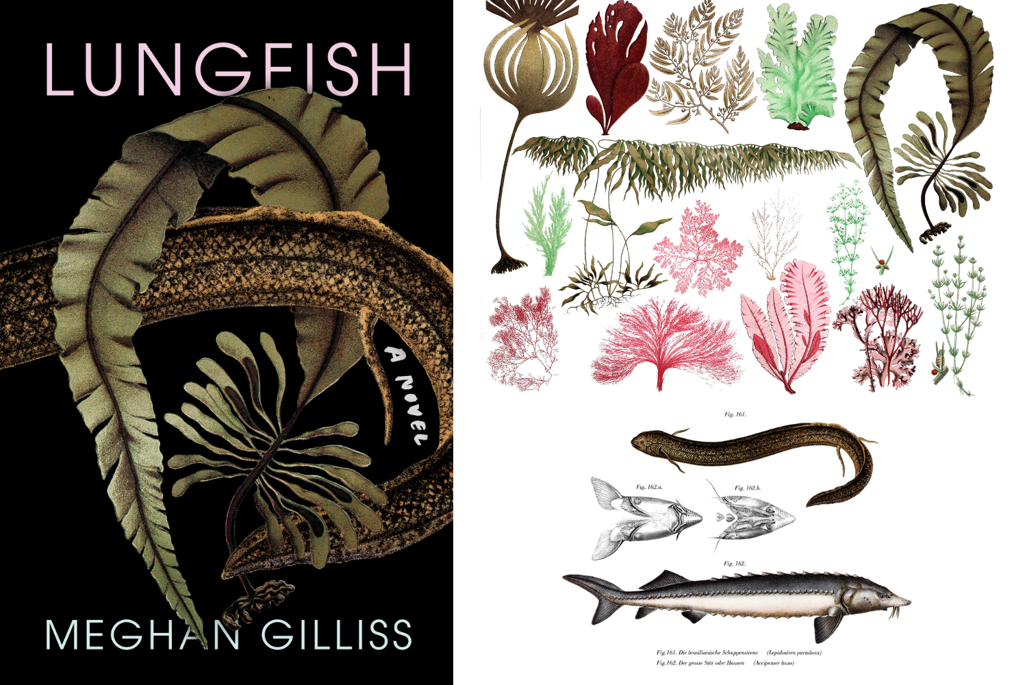
Bottom Image: South American Lungfish (colour litho), German School, (19th century) / Private Collection / © Purix Verlag Volker Christen / Bridgeman Images
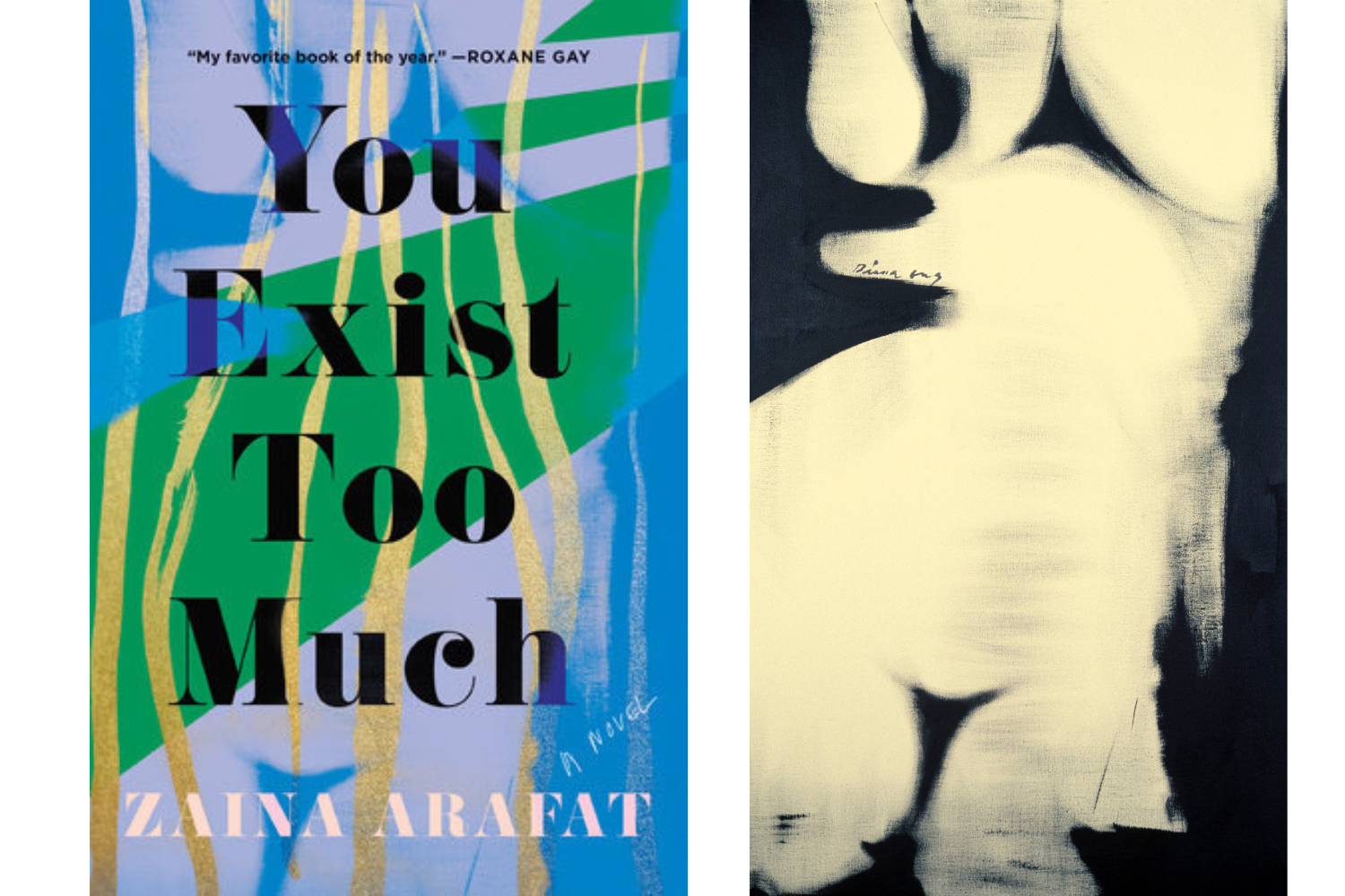
On the You Exist Too Much cover:
NC: Tells the story of a Muslim Palestinian American woman who grapples with her sexuality against the backdrop of a forbidding culture and religion and throughout the entire book there are cycles of toxic relationships, searching for satisfaction in others instead of inside the self. There's love addiction and really self-destructive behavior and a very conflicted relationship with her mother. It's literary, dark and sultry and very witty and the author wanted bold colors and color gradation and a vintage or retro feel through font use. I don't know if you remember the Incendiaries cover but that was sort of the beginning of this trend that was starting where you have these really bright bold colors and abstract shapes and so the author was very much desiring that look. It's interesting because there's been a lot written about designers leaning heavily into those types of designs and oftentimes this is at an author’s request. So many of the designs I did were sort of blurred, bold and bright. I wanted them to be gold rimmed, loud, celebratory and proud and something that would show this fragmentation of the self. Some of the lines that inspire the cover: ‘I enjoyed my ambiguous appearance, I enjoyed blurred lines. Looking at me I wanted to say to her: “please don't look away.” It is a bizarre and unsettling feeling to exist in the liminal space between two realms unable to attain full access to one or the other.’
‘My chest was heaving up and down bubbles rising like in a champagne flute reaching the surface and popping in my throat.’
So this was one of those covers where I was mostly wanting to show the mood of the book or a general feeling of the main character’s journey, personality, and thoughts and creating a visual that embodies our narrator’s spirit and the challenges that she is navigating. One of the reasons why I love working with Bridgeman images is you have so many images that can be manipulated and so in this case where you're looking for sort of a clashing of styles it was perfect. I am using the illustration of the woman in the background which was a black and white image originally and then adding my own illustrative elements. It just worked perfectly for the concept and I love that there's no rights issues when you manipulate that heavily on some of the images licensed through Bridgeman Images.
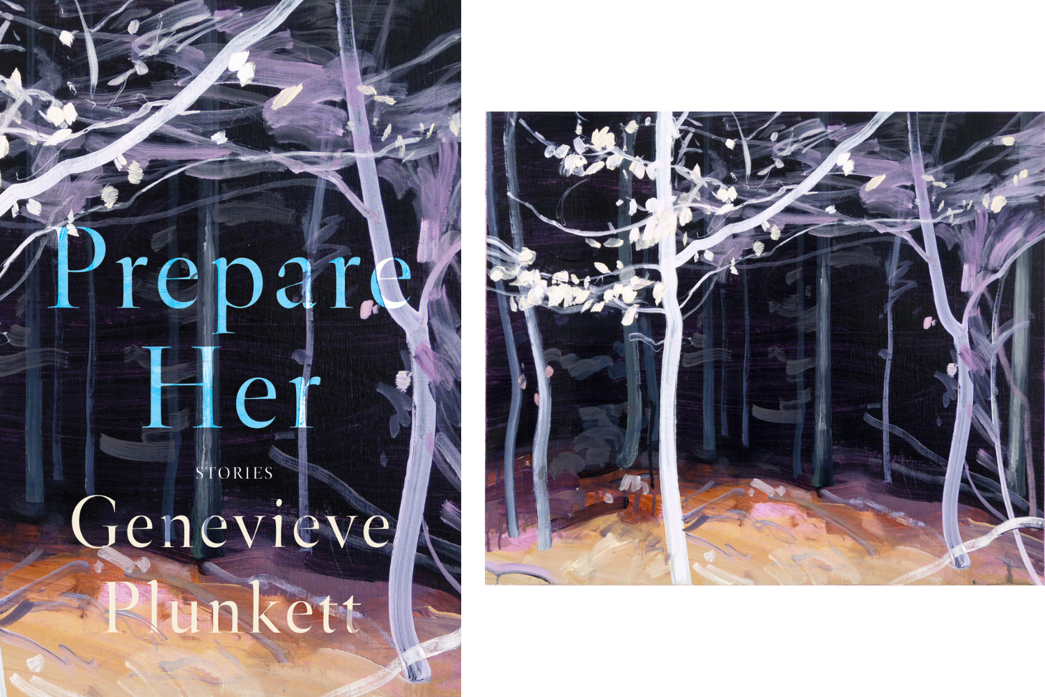
On the Prepare Her cover:
NC: Is a book of stories set in Vermont about working class women seeking freedom from confusing and undermining boyfriends. The title was inspired by a few things but in one of the lines from the book she hears her mother's and ex husband's voices in her head stating that she “failed to prepare her” when she's handling matters surrounding her daughter’s sexual maturity and so it's really subtle, wise and rueful and understated and they wanted the cover to look literary. It's set in rural Vermont and so a design that suggests a sense of place was desired. The cover needed to evoke a sense of fighting for independence and a fight for the self between the mother and the daughter and to also be dreamlike and atmospheric to really match the text as well as have some haunting tension. I designed several options for this, probably about eight designs. Most of the other options were photographic and the inspiration behind this design is this particular passage: ‘sometimes the trees are wet and full of sun and their naked branches form a brilliant snarl of light. Other days the snow settles every twig and the effect is clean and meditative, every complicated surface retraced and made sense of. Rachel knows that there are paths through these woods, her mother owns the land but she allows the neighbors to ride their horses through which brings Rachel a sense of comfort. It somehow makes the whole cold bitter forest easier to fathom.’ So the cover design gives a sense of place and illustrates this overall feeling of beauty and the haunting nature of the text with boldness but also a subtlety.
On the Chorus cover:
NC: Chorus is a novel centered around the Shaw family and it spans the early 20th century through the mid 1950s and there are two life altering, mysterious events that loom large over the seven siblings and that follow them through their adulthood and middle age. We get to see how each sibling uniquely handles their trauma surrounding the events and how these events mold their adulthood and also how the events sort of scatter them and then bring them home. The author and the team wanted something similar visually to the Gunners cover (the author’s prior novel) desiring this central image that is surprising and unpredictable. I used the same typeface and the image style is the same and you get a sense of the entangled connection of the siblings and then that surprising insect. So the design was really very much based on how we can call back to the cover for her last book, which also was similar in that you have this group of people sort of navigating a mysterious sort of secretive situation. Readers should also keep an eye open for Rebecca’s new book coming from Counterpoint in 2024 and the cover follows the same aesthetic approach of her previous covers for Chorus and The Gunners.
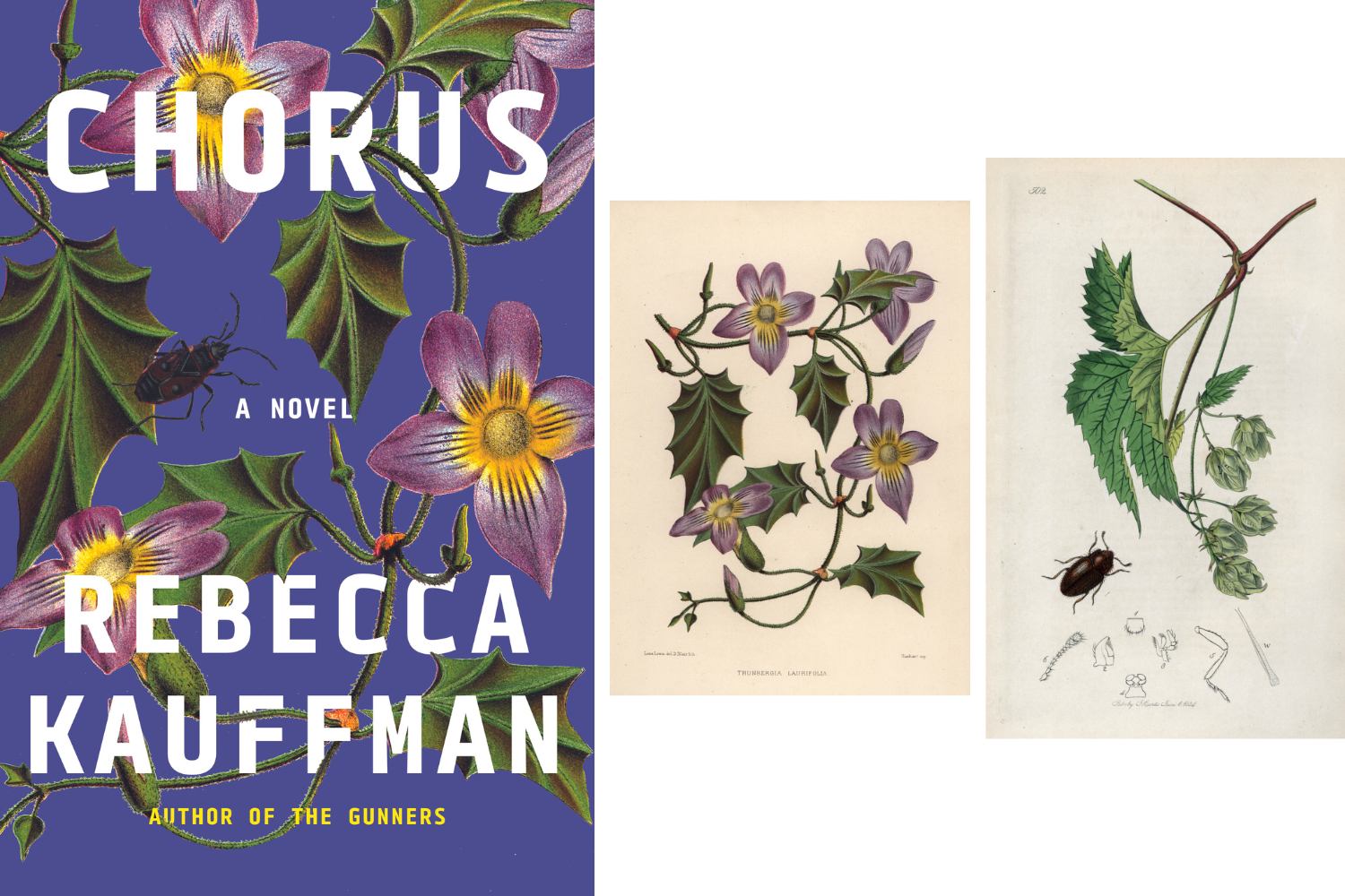
Right Image: Insect: a variety of coleoptere mycophagus with a branch of hops or northern vines. Lithograph by John Curtis (1791-1862) published in “British Entomology”, a collection of 770 illustrations and descriptions of British insects, London, England, 1824 to 1839. Mycetaea hirta, Hairy cellar-beetle, with common hops, Humulus lupulus. Handcoloured copperplate by John Curtis (1791-1862) for his own “” British Entomology, 770 Illustrations and Descriptions of the Genera of Insects found in Great Britain and Ireland,” London, from 1824 to 1839. / © Florilegius / Bridgeman Images
How is Bridgeman Images involved in your design process?
NC: There is a real ease to searching for images through Bridgeman. There is just an enormous range of options of great images for nonfiction and fiction and it’s often works by Bridgeman contemporary artists that I'm using. I also love the ease of ordering and that you allow the downloadable high resolution comp images. Oftentimes we're kind of in the moment designing and it's great to just be able to have easy access to those images when we're comping up and there's also a greater chance that something's going to be approved when we're starting with high res. I think Bridgeman is catering so well to us and I appreciate it and we just love you guys!
We thank Nicole for her time and insights, explore more of her work here.
To learn more about Book Cover solutions with Bridgeman Images see here.
Learn about the 2023 Bridgeman Images International Book Cover Awards here.
Need help?
Can not find what you are looking for? Contact us. We are always more than happy to help you with your research, at no obligation or additional cost.
Finally, if you want to register or connect to our site, you will be able to access several additional tools, including being able to download images and videos faster.

